Pharmacy rebrand
Great Lakes Pharmacy brand identity
THE CHALLENGE
The Great Lakes Pharmacy was moving shops and were looking to refocus their branding and engagement to attract a younger demographic. We had to retain some of the original brand whilst adding a vibrant-beach feel all within a tight time frame.
OUR SOLUTION
We distilled the ideas into one big idea. The intersection between personal health, advice and a vibrant life. This geometric intersection allowed us to create a modern vibrant brand whilst retaining a caring, reassuring feeling. We’re very proud to achieve a new standard in Pharmacy branding.
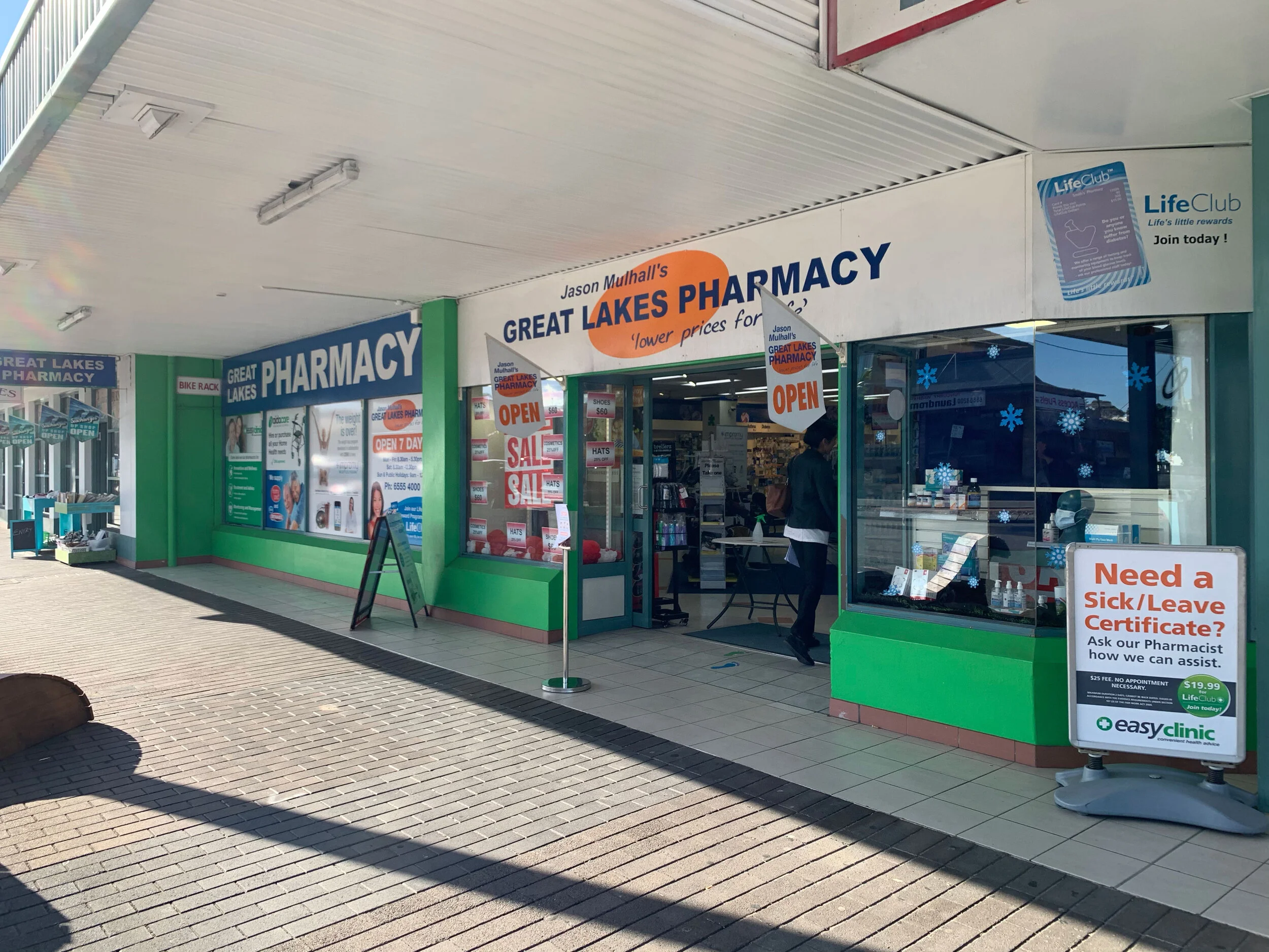
The old look
The New

The process


THE BIG IDEA
“INTERSECTION”
This geometric intersection combines
personal health advice with a vibrant coral life.

“We love it!
You did a great job of incorporating a bright, modern, and fun style into our brand refresh, while also enhancing our more traditional and professional pharmacy presence for Great Lakes Pharmacy. We really appreciated how you took us on a journey that was sometimes a little uncomfortable and challenging. Thank you for all your work. ”


